How Not to Rock the Semantic Boat
29 אוקטובר, 2018 ב- 18:45 | פורסם בראיתי-שמעתי | כתיבת תגובהMy upcoming talk at EMNLP
By Yuval Pinter
Imagine you’re building a boat, starting from a heap of parts. With each new board or screw, you make sure that it fits the adjacent parts, and that the material type is suitable for the section of the boat it’s in. But there are also bigger concerns to consider – is the new part changing the structure of the boat as a whole? Will it remain stable, or will it start rocking? Maybe there are other places where this part fits that would make more sense, but it's not even where you’re currently looking.
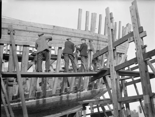 Photo credit: Wikimedia Commons
In Natural Language Processing (NLP), some aspects of linguistic structure are like a boat. Specifically, the structure known as a semantic graph helps a wide variety of AI systems represent knowledge about the world by explicitly connecting linguistic concepts using different relations to create a massive network where each…
View original post 685 מילים נוספות
Phonetically Boring Languages
11 ספטמבר, 2018 ב- 03:08 | פורסם בEnglish, ג'ון נאש, יצירתי, ספרדית, עברית, פונטיקה, רשימות | כתיבת תגובה[This may be my longest-sitting draft that I finally made into a post. I started it in June 2017, shortly after this graphic made the rounds.]
After studying phonetics in my first year at Tel-Aviv University, I developed a pet theory. See, every phenomenon we came across that was "unique" (or rare, or marked) seemed to have somehow skipped over the Hebrew language. No crazy nasals, no retroflexes, no gutturals (in the standard Israeli dialect), no clicks, no ingressives, no voiced alveolar lateral fricative, just the five canonical vowels, et cetera. My thoughts were, since Modern Hebrew is a revived language co-learned by people from very distinct linguistic backgrounds in a relatively messy (high-entropy) distribution, the phonetic portion of it evolved to a low-common-denominator, most phonetically boring language out there.
But where there's data, there's a chance to test out pet theories. So as soon as I got word of the phoible dataset I immediately jumped and put my theory to the test (then waited 15 months for absolutely no reason to actually publish my findings).
Phoible is an open, simple-format data source for phonetic inventories of language. A few clicks, and you have a table of all phonemes across all languages. Thus my definition for boringness of language converged to:
A language is boring if it chooses boring sounds for its inventory.
Now I need to figure out which sounds (phonemes) are boring, but that I just define based on their frequency across languages, which gives me a clear algorithm:
- Calculate each phoneme's frequency in the database
- For each language, calculate average phoneme frequency from its inventory
- Rank languages from high to low average (high = boring)
That's it! For my first finding, Modern Hebrew got a score of 0.415, which ranked it 1,426th most boring in a field of 2,155 languages, an utter refutation of my hypothesis. The most boring language according to this metric is Southern Nuautl with a score of 0.764; the most interesting is !xóõ (yes, that's a click sound it's starting with) with an astounding 0.103. The average score was 0.464 and the score progression is a normal-distributed thing of this:
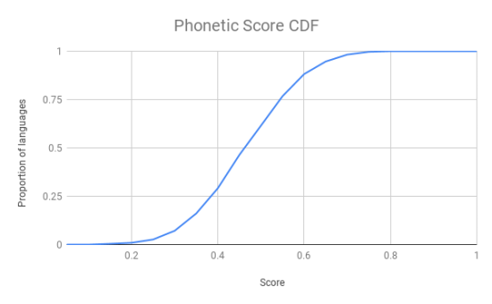
(CDF = cumulative distribution function, meaning: y many languages have score up to x)
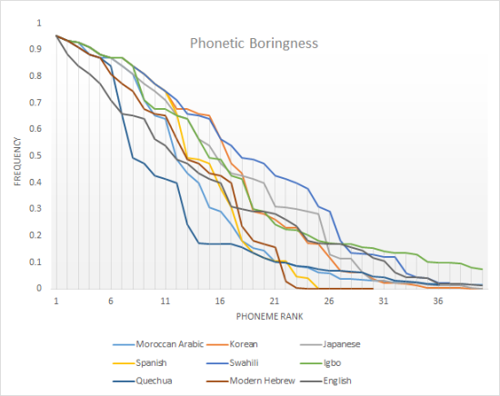
Here's a taste of some languages I thought could be of interest. Check out that lovely long tail of Igbo, which has may phonemes but a lot of the frequent ones; or how fast Quechua plummets from frequent to semi-frequent to rare phonemes; or how boring Swahili, a high-contact language dominating the 20's of the x-axis, is (it's what I expected the Hebrew situation to be, and even so its score is a very unboring 0.292); or how English falls so quickly in the beginning, with all its weird vowels and labiodentals and taps and flaps.
This could mean a few things about why I didn't get what I expected, as well as some other unrelated reasons:
- Like always, data is dirty (or at least, this data, for my analysis needs). In this case, more well-documented languages may have more phonemes in their dataset, probably leading to some that are rare, than languages with less extensive research done upon.
- My metric must suck. See how Hebrew has the fewest phonemes in the selected sample? That's gotta account for boringness and yet, with my mean it doesn't. Look how many frequent phonemes Swahili has, and yet its average is very low. Let's consider some other metrics ("Future work". Remind me to upload the data if I don't do so soon):
- Number of phonemes (a boring metric for a boringness question)
- % of phonemes above a boringness threshold p.
- Area under the boringness curve (this is just the sum of boringnesses again – but maybe cut it off at some point?)
- Deep neural net trained on all these features with the single data point <Hebrew, TRUE>.
- A bug in my code. As soon as I find it I see if I can look deeper. I mean it's kind of a miracle that I have the post-processed TSVs around, to be honest.
Learning to Represent Words by how They’re Spelled
19 מרץ, 2018 ב- 23:02 | פורסם בEnglish, חישובית, כתיב | כתיבת תגובהA fundamental question in Natural Language Processing (NLP) is how to represent words. If we have a paragraph we want to translate, or a product review we want to determine whether is positive or negative, or a question we want to answer, ultimately the easiest building block to start from is the individual word. The main problem of this approach is that treating each word as just a symbol loses a lot of information. How can we tell from such a representation that the relationship between the symbol PAGE and the symbol PAPER is not the same as that between PAGE and MOON?
Some popular techniques exist that try to learn an abstract representation which identifies these relationships and preserves them. In essence, what these methods do is go over a huge body of text (a corpus), like the entire English Wikipedia, word by word, and come up…
View original post 518 מילים נוספות
התא פה חסר לי
31 ינואר, 2018 ב- 16:41 | פורסם בג'ון נאש, תרבות | כתיבת תגובה[שימו לב לעדכון בסוף – ערכתי גם על ישראל. השיר בסדר.]
אני הולך היום לראות הופעה של נורית גלרון. כיף לי!
בעודי מכין את עצמי אתמול בשמיעת פלייליסט מכובד של שיריה בעבודה, הרהרתי לעצמי: רגע רגע רגע. מה פתאום גשם מכסה את אספלט הכביש ביום הכי קר בשנה? הרי בדרך כלל כשיורד גשם יש עננים, וימים מעוננים נוטים להיות לא הכי קרים כי הם מהווים שכבת בידוד או משהו. בכל מקרה למיטב נסיוני, אחרי שהגשם מפסיק והעננות מתפזרת נהיה דווקא יותר קר, לא יותר חם. לא?
מה יקרה אם פתאום נבדוק את ההשערה? נתחיל בחיפוש אחר דאטאסט זמין וקל לניתוח. איפה אפשר לחפש היום דבר כזה? בכל מקום, אבל אני ממליץ למי שעוד אין לפתוח משתמש בקאגל. חיפוש קטנטן של in:datasets weather מעלה מיידית עשרות אפשרויות. אז מזג אוויר ישראלי לא מצאתי, אבל התוצאה הראשונה שכן קרצה לי היתה זו של אוסטין, טקסס, עיר עם טמפרטורות יחסית דומות למישור החוף וכמות משקעים דומה בחודשי החורף.
אמנם קצת מבאס שהנתונים הם רק לשלוש שנים שלמות (2014-2016) עם קצת שאריות לפני ואחרי, אבל הכל מתקזז אל מול המופלאות של קאגל. לא צריך להוריד קובץ, לא צריך להרים סביבה, כלום. פשוט פותחים קרנל (סביבת כתיבה והרצה של קוד בתוך "מחברת" מתעדכנת המורכבת מתאים; קאגל תומכים בפייתון ואר [R]) על האתר והוא מריץ לעצמו את הכל ברקע. אז התכנון היה להשתפשף עם הקוד על השלוש שנים של אוסטין ואז ללכת לגוש מידע גדול שאשיג ממקור אחר, אבל כבר המיני-ניסוי הזה הבהיר שההיפותזה שלי לא מחזיקה מים (הא!) ואני מציג בפניכם את תוצאות הכשל הגדול:
הנתון הסותר: ב-10 בינואר, 2015, נמדדו באוסטין 36 מעלות פרנהייט (בערך 2 בלשון אדם), הכי מעט באותה שנה, וירדו 0.3 אינטשים של משקעים, שהם כ-7.5 מ"מ, בהחלט מספיק כדי לכסות אספלט של כביש.
הישארו עמי לניסוי הבא, בו לפני הופעה של יזהר אשדות אחטן כבד בבלנדר ואבדוק אם אפשר לשתות אותו.
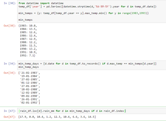
[עדכון, 31/1: בעצתו של ליאון התותח הלכתי לאתר השירות המטאורולוגי, שם ניתן להוריד נתוני מזג אוויר משלל תחנות בארץ. הורדתי קובץ עם כל ימי הגשם כפי שנמדדו בבית דגן בין השנים 1983 ל-1992, העשור לפני שהשיר יצא (כולל). הורדתי קובץ נוסף עם הטמפרטורות היומיות. הרמתי מחברת במחשב האישי. היו שמונה ימי גשם כאלה בעשור הנ"ל. הנה המחברת, והנה צילומסך של הסוף שלה, כולל התוצאה בתא האחרון.
]
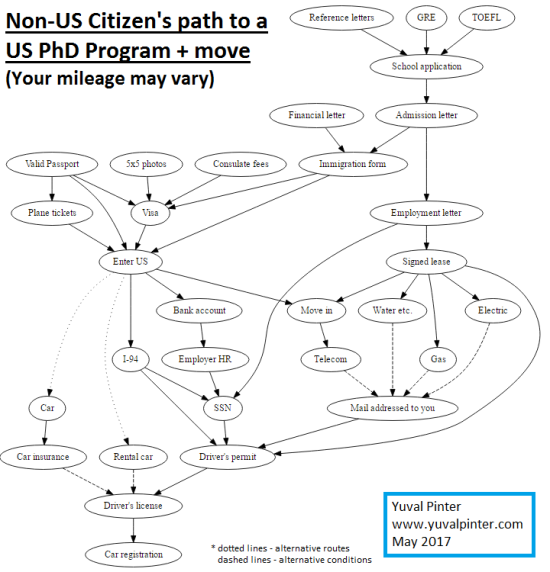
Bureaucratic Path to PhD Studies
12 מאי, 2017 ב- 20:09 | פורסם בEnglish, ג'ון נאש, יצירתי, מנהלי | כתיבת תגובהHere's the path I took, as a non-US-citizen, before moving to the US and starting a CS PhD program. I took the GRE and TOEFL around summer of 2015 and moved in August 2016.
I provide it as a reference for similar-minded folk, but keep in mind times change, circumstances vary, and I may have forgotten crucial steps. In any case, enjoy.
(Created using GraphViz)
Google's Translation Overhaul – Interview on IDF Radio
17 אפריל, 2017 ב- 17:48 | פורסם ב15 דקות, English, אנגלית, עולם דיגיטלי, תרגום | תגובה אחתThis February, I gave an interview to Ido Kenan on Galei Tzahal (IDF Radio) about Google's upgraded Machine Translation system, including its claims that it learns an intermediary abstract language representation, an "Interlingua".
You can listen to the interview here, or read my writeup here on Kenan's blog. Problem is, it's all in Hebrew! Well, what better than to use the fancy new Google Translate to render the thing into English?
Here it is, untouched. See how much you understand. (Retrieved March 16, 2017)
Continue Reading Google's Translation Overhaul – Interview on IDF Radio…
Turnout, Burnout
10 נובמבר, 2016 ב- 19:35 | פורסם בEnglish, פוליטיקה | כתיבת תגובהI have yet to see a piece trying to tie the two together (please correct me if I'm wrong).
My claim is simple: citing the nationwide 56.5% figure as a strong indicator for voter apathy is somewhat misleading. If a Californian feels they don't see the point in voting (and registering beforehand), it's different than a Pennsylvania voter (in this elections cycle at least, but pretty much usually). It's unfair, but understandable, if there's a (say) 15 point difference in their turnout rates.
Let's look at the numbers then, shall we? On the x axis, we'll place the ultimate victory margin (collected Thursday from Wikipedia) as a proxy for how inclined an average voter was to believe that his vote would be crucial. It's not a perfect proxy of course, as there were some state-level surprises. Maybe poll margins prior to registration deadlines would have been a better one. The y axis will denote the voting turnout (collected from electproject.org).
Before the chart, observational data: of the 11 states with highest voter turnout rate, 10 ended up with a margin under 5%. Of the 10 states with margin under 4%, only one had a turnout of less than 60%. Now you can look at the chart, including a simple linear trend line.

Forgive my dataviz-unsavviness. I wish I knew how to add state labels to each point on gsheets.
As you can see, the results are pretty straightforward. With a not-bad correlation of 0.21, it seems voters chose to turn out based on how close they anticipated the race to be in their state. I didn't leave out the outliers but they're not shown in this chart (DC is always ridiculous, this time with an 86% victory margin. Hawaii significantly undervoted with a 34% turnout, way under the next, California at 45.5%). It was cool to see Utah as a special case here with its 3-way race – a 19% D-R margin brought significantly less people to the polls than Montana or Washington state who ended up with about the same margin.
All in all, the voters who mattered in this Presidential election (tough phrasing but that's the way it is) came in at about 65%, much higher than the national average.
It's worth noting that the numbers, even for the swing states, are still low compared to most of the democratic world. But I'll also note that the US has other factors going for it, such as the no-day-off thing, or the huge amount of expats allowed to vote, which is a unique characteristic. According to electproject, these compose roughly 2% of the eligible electorate.
Georgia Tech at NAACL 2016
26 יוני, 2016 ב- 13:31 | פורסם באקדמיה | כתיבת תגובה(Original author: Jacob Eisenstein)
כן, אדוני השר המואשם שוב בפלילים
8 אפריל, 2016 ב- 19:31 | פורסם בלקסיקון, עברית, פרגמטיקה, ראיתי-שמעתי | כתיבת תגובהשרי רוט מפגיזה בהפלוג:
אין מצב להשאיר את הספינה בלי רועה.
אגב, למה שפורר קיבלה שם קריטורת אילוסטרציה ורוט הוותיקה בהרבה לא?
(אין צורך לענות )
אין לי רגע דל
16 ספטמבר, 2015 ב- 12:37 | פורסם במנהלי, ראיתי-שמעתי | תגובה אחתלא כתבתי פה פוסט כבר כמעט חצי שנה*? סמכו על עיריית חיפה שתעיר אותי מהמתים.
אתר פסטיבל הסרטים ה-ל"א עלה לאוויר בשעה טובה. אפילו שמו תוכניה ברמה היומית של הסרטים עם חלוקת שורות לאולמות.
את ציר הזמן, לעומת זאת, פקדה פשרה מוזרה (שלא לומר מבלבלת שועלים): הימים מסודרים מימין לשמאל. השעות בתוך כל יום מסודרות משמאל לימין. ובתוך כל משבצת זמן, הס פן תעיר, נכתב שם הסרט בכתב אשורי מימין לשמאל. מבולבלים? חכו שתראו את צילום המסך.

פינת סטירה
*בדגש דווקא כתבתי פה ושם: הנה והנה והנה והנה והנה והנה והנה והנה והנה והנה והנה והנה והנה והנה והנה והנה. והצגתי ביסקול וארגננו בהמעבדה טרעק צ'אלאנג'. ועוד ועוד.
** אגב, יש לי גם טאמבלְר. אותו שם משתמש.

יצירה של אתר חינמי או בלוג ב־WordPress.com.
Entries וכן תגובות feeds.
